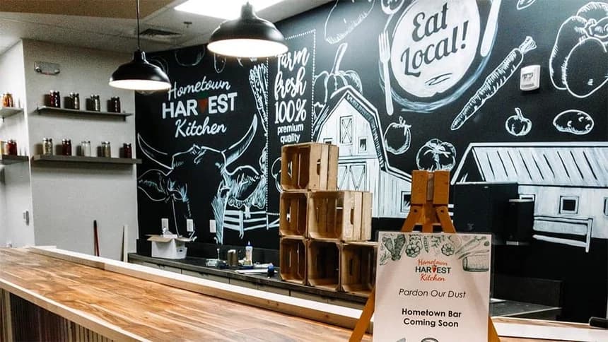
Illumine8 recently won an international MarCom print media award for the design of Hometown Harvest Kitchen’s chalkboard wall.
MarCom, an international competition that receives thousands of submissions every year in the categories of print media, strategic communications, digital media, and audio/video, has been honoring excellence in marketing and communications since it was founded in 2004.
The MarCom Awards are lead by the Association of Marketing and Communication Professionals (AMCP), an organization who “administers recognition programs, provides judges, and rewards outstanding achievement and service to the community.”
The Design
Hometown Harvest Kitchen (HHK), a farm-to-table restaurant in downtown Frederick, partnered with Illumine8 shortly after its launch in June of 2019. Owned by the farmers of South Mountain Creamery, HHK had all the qualities of a winner: experienced leadership with decades of business success, and delicious, farm-fresh food. However, since the restaurant had just launched when the engagement began, HHK did not have solidified brand guidelines or signage in place. After compiling a thorough brand analysis of the organization, Illumine8 initiated an interior signage and branding audit, followed by a design proposal.
“One of the first projects that we hit the ground running with after onboarding was the HHK signage audit,” said David Boudjeda, account manager at Illumine8. “It was a comprehensive project with many working pieces that involved a complete redesign of the restaurant’s interior. We had to think about every single touchpoint that a customer would encounter throughout their buyer’s journey and design a cohesive brand image to solve pain points and create a narrative around the restaurant.”
Boudjeda and associate account manager, Liam Redding, mapped out all of the touchpoints in the restaurant and began conceptualizing design possibilities. One of the first ideas that both Illumine8 and HHK agreed upon was a large-scale chalkboard wall.
With the guidance of Boudjeda and Illumine8’s creative manager, Erik Pitzer, Redding began drawing up a design for the 104 sq. ft. wall.

Hometown Harvest Kitchen’s chalkboard wall
“There were many unique challenges that had to be taken into consideration during the design process,” said Redding. “The design layout had to flow well with the dimensions and shape of the wall, the sheer scale of the design pushed the software to maximum capacity, and we had to think about how we were going to translate the design from the computer onto the physical wall. It was complex on multiple levels before we even began to formulate a creative direction for the piece, but the challenges are what made this project exciting.”
While the creative direction for the design may have been easy in isolation, the I8 team had to think creatively about how the chalkboard wall was going to play cohesively into the rest of the restaurant’s environment.
The final installed design was hand-painted on the 16’ by 6.5’ wall based on Illumine8’s design. Other elements of the signage audit included a repurposed wooden wall, the installation of television with branded information slides at the point of purchase, interior window designs that give customers the perspective that they are looking out onto the farm, several branded designs frosted onto windows and freezers, and other minor touchpoints throughout the restaurant to solve customer pain points.
“This was really the first major project that I worked on at Illumine8, so it will always be one that I am fond of,” said Redding. “I am honored, and I am thankful for the incredibly talented team at Illumine8. I couldn’t have done it without their help.”
