Have five minutes to spare? Here are five super quick tips that may help improve your design:
1. Add White Space
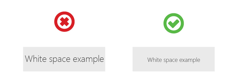
Almost every subpar design I come across has a white space problem. And 99% of the time it's because there is not enough. Unless you're designing for an exterior sign or another medium where it makes sense to use the majority of the space available, let your design breathe!

Even just an extra 10 pixels of padding can go a long way to quickly improving a design.
2. Mock It Up
For a potentially helpful perspective, take your design and visualize it on its final real-world use. Designing a logo? Slap it on a coffee mug. Creating signage? Grab a screenshot from Google Street View and paste your sign into scale. Even application or mobile website designs could benefit from visualizing it on a physical phone before actual development.
3. Go Black & White
For another exercise on perspective, take your entire design and make it black and white. Does it make sense? Does the design still accomplish the message that you intended? If not, your design probably relies too heavily on color and may need adjustment.
4. Utilize Unique Font Weights
Need a thicker font weight? Go beyond the typical "Bold" and use a font family that has a wide variety of weights—try a "Black" weight for even bolder, less common look. On the other end of the spectrum, "Light" and "Hairline" weights provide much thinner options than the standard "Regular" or "Medium" weight.

Even the use of very common fonts like Helvetica can give your design a fresh, professional look with the right contrast of weights.
5. Get Feedback
Ask for feedback from your friends, family, colleagues, and even kids—kids are the most honest humans you’ll ever meet. After spending hours or even days on a design, your eye can become blind to flaws that are obvious to others. Besides asking them what you could change or what they do/don’t like about the design, ask questions such as “If you could describe this design in three words, what would they be?” or “What kind of feeling do you get from this design?” See if your peers give you feedback that aligns with how you intended the design to speak for itself.
Different perspectives help improve your design, and also help prevent any potential negative backlash.
