Whether it’s Disney recognizing 100 years or your local brewpub raising a glass to five years in business, company milestones present a great opportunity to showcase success with a simple visual.
Anniversary logos depict a treasure trove of positive traits: longevity, trustworthiness, stability, dependability, character, prominence, prestige, and durability.
Commemorating longevity through the design of an anniversary logo allows companies to easily communicate to their stakeholders all of those positive attributes in a single moment.
The Importance of Longevity Branding
At Illumine8, we thrive in helping established construction, contractor, building, and manufacturing businesses grow through measurable marketing, strategic branding, sales, and customer experience strategies. We understand the importance of stability and continuity and have worked alongside many built-environment businesses.
It’s no secret that multiple key factors contribute to a business’s long-term success. Our own Founder & CEO Christina May recently explored the fabric of centennial businesses and discovered their common traits: a strong corporate identity, a focus on core strengths, and dangerous innovation.
“Throughout a sustainable brand’s history,” as mentioned in Forbes, “the brand’s promises have always been clear in terms of what is celebrated and what is valued.”
And while there is certainly an intricate roadmap for staying in business for 100 years, there’s no magic formula when it comes to choosing a milestone year. Find a nice, balanced number — 25, 40, 60 — whichever is next on the horizon, and seize the opportunity to communicate the impressive longevity.
The Anniversary Logo & Design Elements
When the anniversary to celebrate has been chosen, it’s time for the pièce de résistance: the logo. Companies can take many creative liberties with any anniversary, but there are three noteworthy core elements commonly used to compose a strong anniversary logo:
- Prominent numbers
- Concise messaging
- Established year range
Let’s explore each of these in a little more detail:
Prominent Numbers
Clear, bold digits are the cornerstone of any anniversary logo and should consume the majority of the visual space. Clients, customers, employees — anyone viewing the logo for the first time — will instantly recognize and understand the milestone at first glance.
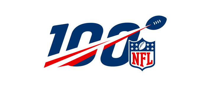
Even with the added football streak, there is no mistaking how many years the NFL celebrated with their popular “NFL 100” logo.
Concise Messaging
Not only is an anniversary logo an opportunity to communicate your longevity and established place in the industry, but it’s also a golden opportunity to broadcast your company messaging.
Rather than a simple “Celebrating 40 Years,” take it one step further and concisely state what the company is celebrating: “Celebrating 40 Years of Award-Winning Service,” “Celebrating 40 Years of Building Communities,” “Serving Engineers for 40 Years,” etc.
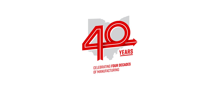
To celebrate the 40th anniversary of their first plant in Ohio, Honda included a clear, simple “four decades of manufacturing” line of text to their logo.
Established Year Range
Including the range of celebrated years as a part of the logo — though the most optional of these three facets — is a simple and flexible way to further communicate a company’s longevity.
In 2017, Illumine8 spearheaded an 80th-anniversary logo design for a client. While the clean “80” certainly conveyed the message of company longevity, seeing “1937” on the logo added an extra layer of impact and historical reference.
Including an established year range isn’t always obviously positive. Adding a range of years for younger celebrations may not carry the same impact. For example, 15 years is an impressive milestone for a lot of companies. But would seeing “2005” add any additional layer of impact?
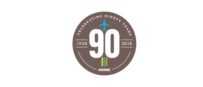
Though the “90” is the primary visual in USAIG’s 90th-anniversary logo, including “1927” added another layer to communicate the company’s longevity.
Incorporating an Anniversary Logo with Existing Brand Guidelines
An anniversary logo is also an opportunity to expand on your brand identity, not detract from it. While many anniversary logo instances won’t take the typical shape and layout of a company’s standard primary logo, it’s important to carry over certain elements to maintain visual cohesion.
Consider the following:
Color
Color is the most important element in maintaining cohesion. While companies can certainly introduce a flutter of new color, any large visual or core elements within an anniversary logo should contain the company’s core color(s).
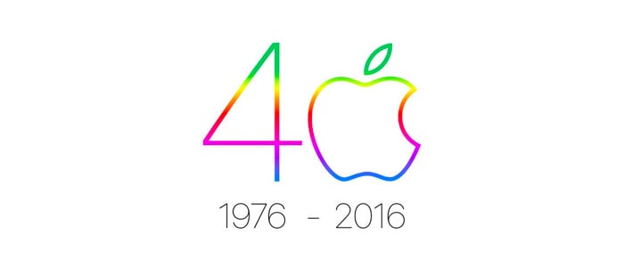
Apple paid homage to its famous early multicolor logo with a colorful, modern twist to celebrate 40 years in 2016.
Typeface
Similar to color, anniversary logos will allow some creative freedom in introducing new fonts. Unlike color, the primary visual element — the large digits — does not necessarily need to adhere to established typographic brand identity rules. If you’re taking that license, however, be sure to keep other text elements within the logo in line with existing brand standards.
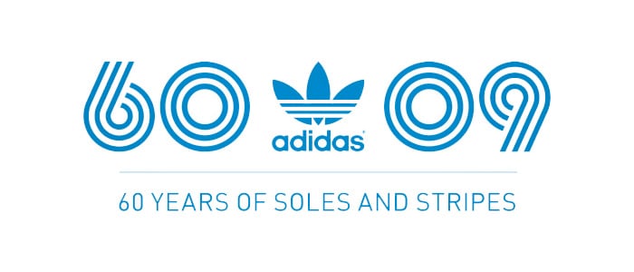
For their 60-year mark in 2009, Adidas abandoned their traditional typography and creatively incorporated their famous “three stripes” branding into the large numerals.
Artwork
If your company’s logo contains a logomark or recognizable art elements, consider incorporating that or parts of that into the anniversary logo design.

For their 50th anniversary, the Pittsburgh Penguins used their primary logo as the base for the design, layering in the anniversary elements around it.
Alone or Added On?
In most instances, a company anniversary logo is a stand-alone mark. However, if that seems too drastic or uncooperative with current branding, celebrating the milestone visually is still achievable.
Similar to secondary tagline logos defined in some brand style guides, the option of “adding on” the anniversary can be a simple and effective option for depicting the company milestone.
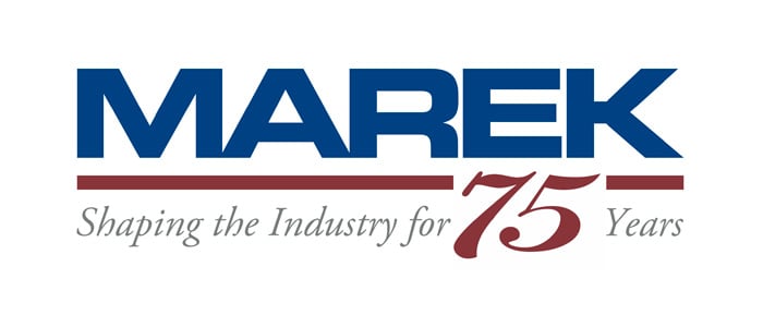
Rather than create a brand new logo, Marek simply swapped out their tagline underneath their bold wordmark to celebrate their 75th anniversary in 2013.
Tactical Deployment: Showing It Off
We’ve covered the importance of visual cohesion when designing an anniversary logo, but have we considered the broader brand communication question on where and how this logo will be displayed?
Let’s start with the obvious: The active shelf life of any anniversary logo is no longer than one year. Unless there is a specific date strongly associated with the anniversary, most companies can utilize an anniversary logo throughout the calendar year of the milestone.
If the anniversary logo includes the entirety or majority of a company’s primary logo, any large format digital use of the current logo could effectively be a straight swap for the new anniversary logo. Places like a company’s website, social media profiles, and email signatures are all effective areas to display the new logo. Any digital ad campaigns run during the milestone year may also incorporate the anniversary logo.
Outside of digital instances, consider swapping the logo for any non-evergreen print material produced throughout that year. Some potential examples include:
- Event banners
- Tabletop displays
- Product packaging
- Posters
- Flags
- Landscaping
- Temporary signage
Even evergreen materials like apparel and promotional giveaways are valued as a lasting tribute to the company milestone.
Unlike a total rebranding effort or the development of an initial logo concept, an anniversary logo design process doesn’t need to be drawn out, burdensome, or resource-consuming. Following these guidelines will ensure a simple, but strong visual to commemorate the success and efficiently communicate company longevity.
